With two of my images I flipped them horizontally so that each of the faces would be facing into the middle. This is so viewers eyes don't leave my 4 images. I chose the 4 with the same leaves because I thought they worked best as a set and looked best together. I wanted my layout to be simple so people would only concentrate on the images. Overall I think my images turned out the way I want them to. They portray the meaning of what a heart means to me and hopefully show a connection between nature and humans. I chose the saying 'The goal of life is living in agreement with nature' as a title because I thought it fitted perfectly with my meaning and images.
Sunday, 14 November 2010
Thursday, 11 November 2010
Blending Images 2
I think this image close up works well because you can see the heart on her nail. I think the natural lighting and pose works with the nature aspect of it all, but I don't know how it would fit with the rest of the images.
These 4 images work really well as a set. Mainly because I have used the same leaves image to blend into the 4 individual images, but I don't know if they are to similar although they do work together because they tell a story.
Blended Images
I've taken the 4 images and created two sets of photographs I could use. With this first set I have used 4 different leave images. This was to see the affects the different images would create over my original images. I think as individual images they work but as a set the leaves are to different so they don't work.
Wednesday, 10 November 2010
Photo Shoot
I have created contact sheets so you can see the images I took on my photo shoot. Out of these images I narrowed it down to 4 main images which I think work best together. After i've picked the 4 images I'm going to blend the leaves into them to create a similar look as the dazed and confused shoot I found.
Final Props
Tuesday, 9 November 2010
Makeup
I'm trying to find ways of portraying my heart emotion across through the makeup or props I use. I've found 3 images which I find inspiring and can help me had the red in to my images. I will try these on my model to add a fashion twist to my nature shots. After taking these I will then blend the images together to create one final image.
Monday, 8 November 2010
Poses
I need to bring fashion into my shots some how. So I want the images I have taken of nature to be my background which I can blend the image of my model into. I want my images to portray life from two different objects; human and nature. I will use hearts to add the red into it so they will fit the brief. I have taken a photo and drawn images of what poses my models going to do to add my hearts in to it.
I will have a head and shoulder shot of my model with her hair in a ponytail so it's off her face. I will then draw a heart on her lips with lipstick. This will stand out against everything else.
I will cut out loads of hearts from red card and place them all into my models hand. I'm not to sure whether it will be just her hands or with her head in it as well. I want these two images to portray that the two objects have hearts by having them blend together.
Leaves
These images will work perfectly for my background images. I tried to take some photos with the flash on but they came out to light so i took the light off and changed the settings to sunset mode. This mode brings out the orange and reds out which is what I want my background images to be.
This image is quite blurred which doesn't work for my background although the leaves are perfect shades of orange and red it has a lot of green in it which might work but I want most of my background to be the leaves.
I tried a sports mode, the image below, but the colours changed to a blue and green tint. This doesn't work yet when I changed the mode to sunset again, the image above, the colours were perfect. This shot will work for my background because not only are the leaves on the tree matching my colour palette but there's hardly any grass showing either and the leaves on the ground are a lovely dark orange.
Trees
I just took an original image of the tree with the setting intelligent auto then played with the colour balance on the camera to see how that would change the colour of the leaves.
The image above I added blue to. I don't think this works with any of the colours I wanted to use. Yet for the image below I added red in to it. Although this still wasn't the autumn look I was going for so I started to look in to different settings that would change the colours to brighter reds, oranges and yellows.
This is on a nature setting which makes the green pop out. This makes my images look more spring then autumn so I won't use this for my final image.
I changed the exposure down to -1 this made the image darker and the yellows turned to light orange. This adds the colours from my palette but the dark brown turns black and I don't think my pictures would look good with black in them.
Sunset mode works perfectly for my shoot. It makes the leaves and trees the colours I wanted and gives the whole shot an autumn feel. I used this for most of my shots.
Experimenting
After the photography tutorial we had on wednesday I thought I would experiment with the different settings on my camera to see what effects I could get.
Exposure
High exposure on the camera doesn't work for the shots I'm trying to create. I brought my exposure down from 2 to -0.5 this made a huge different as you can tell between the two shots. Although I don't think these images quite work with the colour palette I was looking for.
Colours
I went to Birmingham for the weekend and thought this would be the perfect opportunity to take some images of the nature there that I could use as my background shots for my images that I will blend together. I want my images to have an autumn theme to it because I think that would fit with 'red for heart' so I was looking on how to get shades of red, orange and yellow from the trees. I drew up a colour palette.
Wednesday, 3 November 2010
blending images
I wanted to try and blend two images together like the photo shoot from Dazed and Confused but wasn't to sure how to get it to look as good as theirs. So I went on the internet to find a tutorial on photoshop. I came across this tutorial and used 2 images I found off the internet as a trial.
I took the two images above and created the image below, but I then thought I might change the mode on the above image and see if it created any effect which would work for my photographs.
For this image I changed the mode of the top image (the image of the girl) to screen. I then turned the opacity down on the image of the trees to 60% and added a white back ground. I really like this effect and think it would work for my photographs. It gives the same soft effects that the images in dazed and confused had.
For this image I changed the mode of the image of the girl to linear light. I think it gives off a fire feel and makes the images blend in well. Only problem is that the images have got quite blurred but that could work as a nice effect.
For this effect I changed the mode of the image of the girl to hard light. I like this effect, it works because the light colours of red and orange really blend together well and the glitter the girl is blowing blends really well into the trees creating bright coloured leaves.
Dazed and Confused
I have taken photos of several adverts and images from the magazine Dazed and Confused. I find them inspirational and have given me ideas on what sort of effects I want for the images I'm going to create.
This image is great because they have created a completely different feel to the image by having rocks faded in to the background. I think it gives it a hard texture to the image and gets rid of the soft sky.
This image works well because the colouring of the model blends into the trees and mountains beautifully. By making the model a more striking colour it makes him stand out against the back ground even though he's fading in to it.
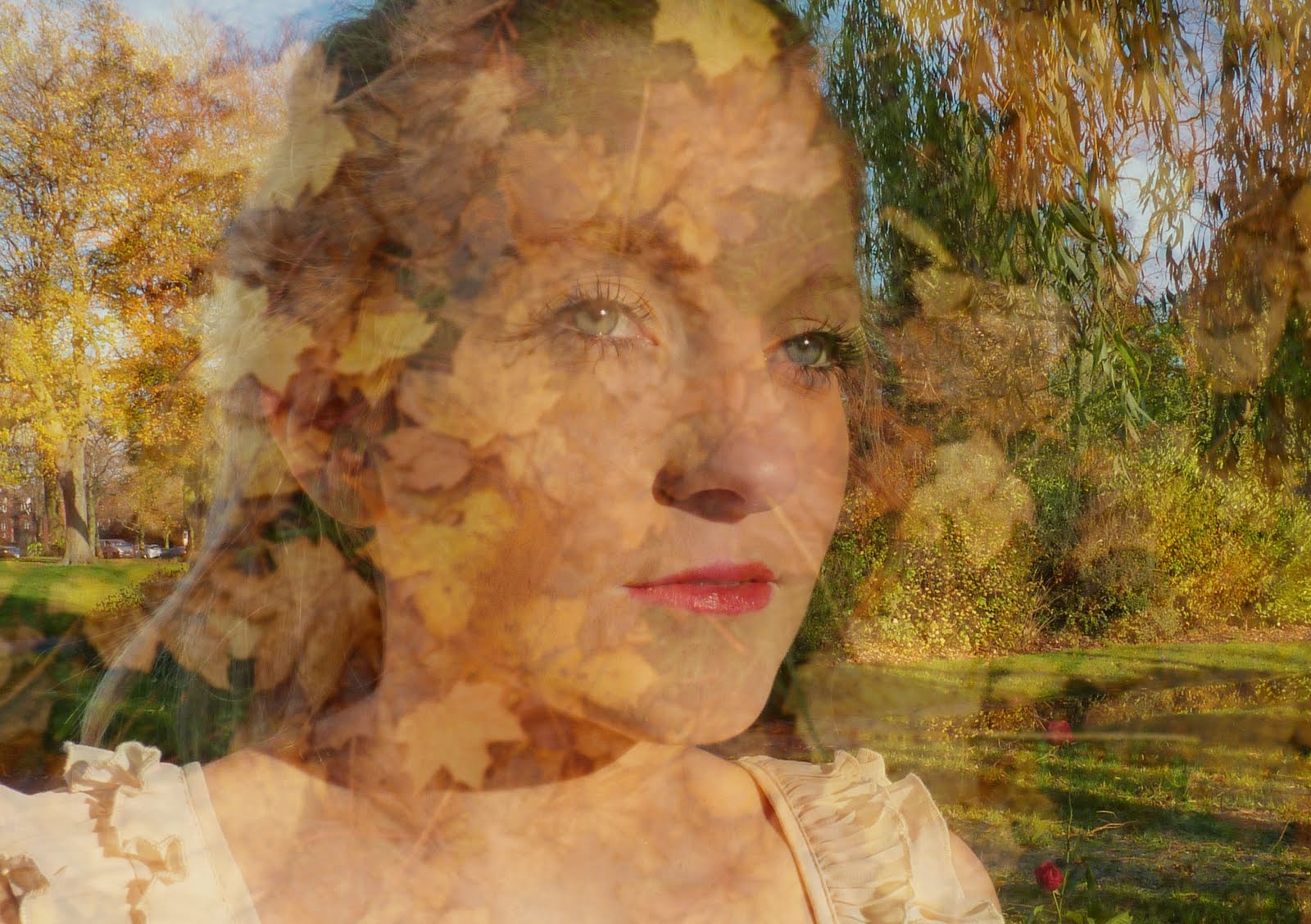
I love how for this photo shoot they have taken two images and blended them together to create a really cool effect. I may consider blending an image of my model and an image of my trees together to create something similar. I think the colour and lighting works really well with the images as well, the soft light brings the colours of the sky and trees out more.
For this image I could create something similar by having a model lie on the grass in a park and have different objects around him. This could include something red so it will relate to my brief.
I chose this image because of how bright the red is which is being used. This gave me the idea of having the red balance very high on my images and instead of having just a red object turning my whole image red. Although I don't know how this will work with my nature scenery, but I will give it a go and see how it turns out.
I chose this image because it's inspirational for me to create a similar look for my photo shoot if I was to go down the route of romance. Although it works for this I don't want to photograph something that has been done before.
Card and Glitter
I then looked into things I could add to the trees if I chose not to use a pigs heart. I wanted to look into how I could use card and glitter to stand out against the nature.
I found this image really inspirational. The way the glitter looks I would add red hearts made out of card in it as well. The background fits perfectly with theme of nature I'm using and I could try different settings on my camera to try and create different images.
I would create red hearts like the one in this image which I can then use for my photographs. I will also make giant card hearts to attach to the tree and have glitter falling from the tree.
Subscribe to:
Posts (Atom)